October 28, 2015

Digital marketing is a skill that can be mastered with a lot of practice through time. To get there you can obviously go through some bad times. That means also learning how to improve digital marketing results. This is something inevitable and today we will explore eight ways to overcome them and turn them around.
October 14, 2015

When it comes to the web in this modern day and age, especially e-commerce websites, mobile optimisation is key. Without it you are potentially missing out on a percentage of sales. Research shows that a massive 57% of mobile users if the loading time is more than 3 seconds.
September 15, 2015
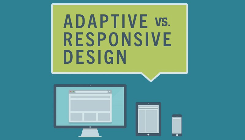
Google has always recommended a responsive web design and rolled out an important update earlier in April this year. This updates works to rank mobile-friendly sites higher based on web design. The secret behind the updated is, it doesn’t specify you use responsive designs, more that your site be accessible from mobile devices, with a good user experience and performance. Keeping that in mind what are the options available to those who are looking at starting their own site? We have already spoken about responsive design in a previous series of post – which if you haven’t read, we suggest you do to find out more and you can find them here!
August 4, 2015
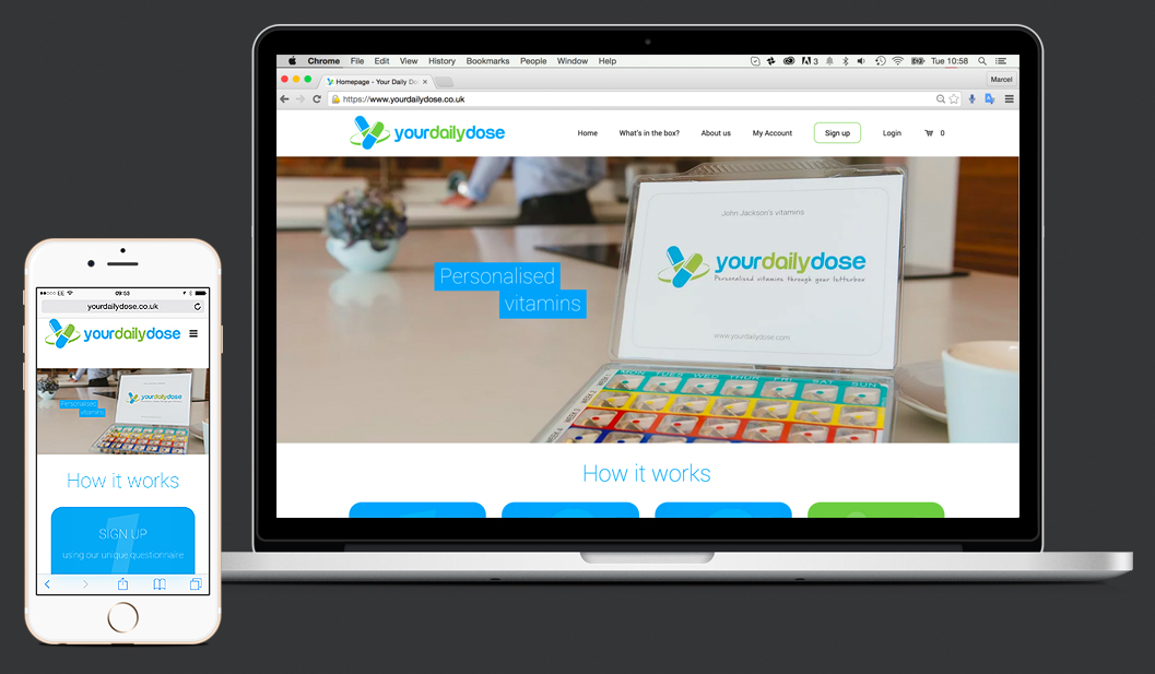
Welcome to our last post for the responsive design series. If you missed our previous posts, be sure to check them out here. In this post we will provide you with a check-list of things you need to consider when making your website responsive. 1. Lighten the load Make sure our website is fast when being loaded. According to Google, around 70% of mobile users will leave a page if it takes more than 5 seconds to load. Make sure the images you use on the website are compressed as much as possible to allow short loading times. 2. Make it touch screen friendly When using fingers to navigate around websites you are less precise than when using a mouse. Make sure the buttons on the site are big and easy to spot. Allow your content to interact with the device it is being seen on. 3. Be clearly readable Smaller screens mean smaller fonts, make sure you choose a font that is just as clear when being read on a big desktop pc or on a smartphone. 4. Be shareable Enable shareable content for users to quickly like, comment and share to other users from any device and across platforms. 5. Stack elements Work out which elements are important for your users when accessing your site on the go and make sure all your core information is there. If you feel like your website needs a makeover or isn’t responsive enough then get in touch and see if we can work with you. [contact-form-7 id=”400″ title=”The contact form”]