July 13, 2015
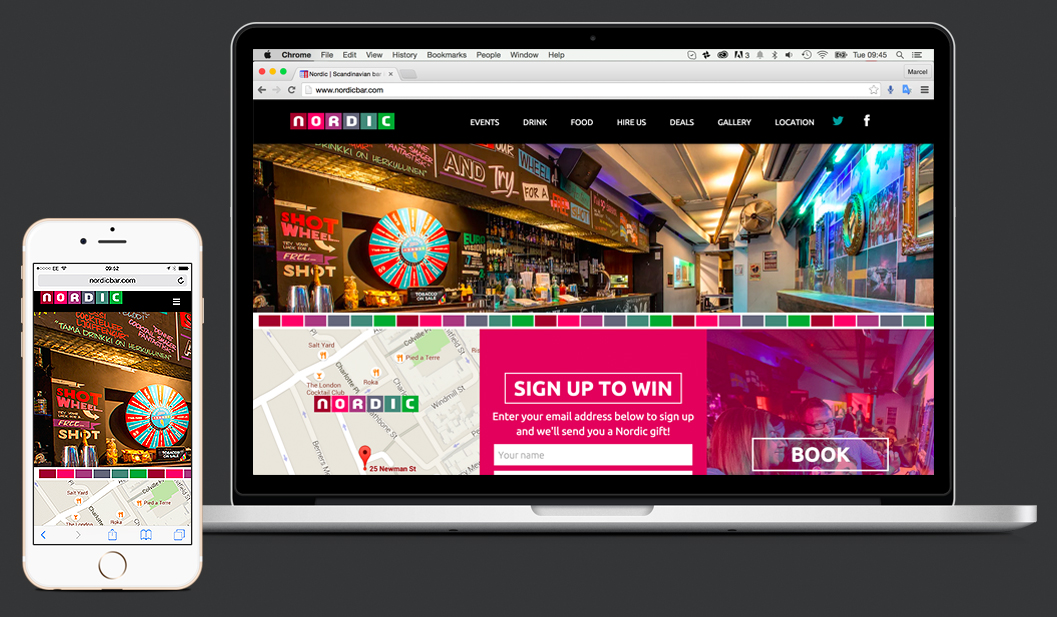
There is a lot of buzz around about websites needing to be responsive. But what does that mean? Responsive web design is a collection of techniques that allow a website to adapt to different device specifications, such as screen size when being viewed. What it means in a more ‘practical’ way, is that, the website is able to recognize the features of the desktop, smartphone or tablet, and easily adapt to it to give an optimal user experience without limiting the functionality. The reasons for this adaptability are very clear. In the second half of 2015, and the beginning of 2016, the usage of smartphones to browse the web is estimated to increase by about 20% compared to the last two years. Therefore, it is increasingly important to keep these users in mind and understand how to properly engage with them to offer the best user experience on all devices. How can we make a better online user experience? Before responsive design, the mobile experience usually translated poorly. The first step towards a better user experience was to create mobile versions of the traditional websites. This is one type of solution but still their capabilities were limited. This is where responsive design comes into play. Thanks to responsive design your users won’t be worried about having to be careful of where they click if using a touch screen or zooming in and out, they simply will enjoy the site as if it were tailored to that device. The image provided above is a perfect example of what we have done with one of the best bars in London, Nordic. Now their website is perfect for big screens and even better on your smartphone. Our next posts will cover further benefits of responsive design plus a checklist of what you should […]