September 15, 2015
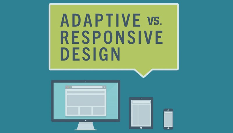
Google has always recommended a responsive web design and rolled out an important update earlier in April this year. This updates works to rank mobile-friendly sites higher based on web design. The secret behind the updated is, it doesn’t specify you use responsive designs, more that your site be accessible from mobile devices, with a good user experience and performance. Keeping that in mind what are the options available to those who are looking at starting their own site? We have already spoken about responsive design in a previous series of post – which if you haven’t read, we suggest you do to find out more and you can find them here!
July 23, 2015
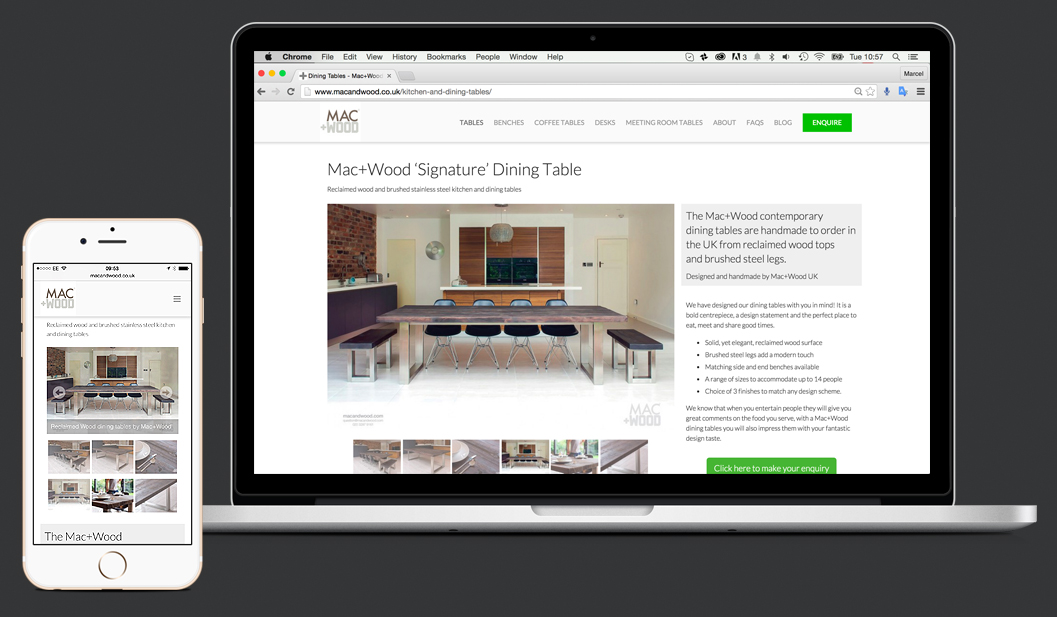
Welcome to part 2 of our responsive design series, if you missed the first post, be sure to check it out here. In this second post we will talk about some of the benefits responsive design has to offer. 1. Flexible web design No matter what device the user experience will be the same. It helps your business be recognized and to be honest people enjoy a good user experience, there is nothing worse than waiting for ever to load a page or complete a login. Happy customers definitely mean happy business. 2. Cost effective website Compare the cost of ‘owning’ one site or owning two…maths aside, you can easily save money and time as you will be able to concentrate on functions, content and updates for a single website that will work seamlessly across devices. 3. Search engine optimization Google itself recommends a responsive web design and the importance of SEO in today’s market means that everything must be on point. If you use the one website for your business you will be able to concentrate properly and create effective SEO. Also all your results will be in the one place. 4. Improved conversion rates A well designed website that is optimized and consistent will for sure have a positive impact on the conversion rate of your site. People will be familiar with functionality and layout, therefore providing them with a better user experience that translates to engagement. 5. Future viability of your website Responsive sites are made to adapt to different systems and characteristics, meaning it is pretty sure that once designed, and designed properly, it shouldn’t require too much work when newer devices hit the market. This point links back to cost effectiveness. [contact-form-7 id=”400″ title=”The contact form”]
July 13, 2015
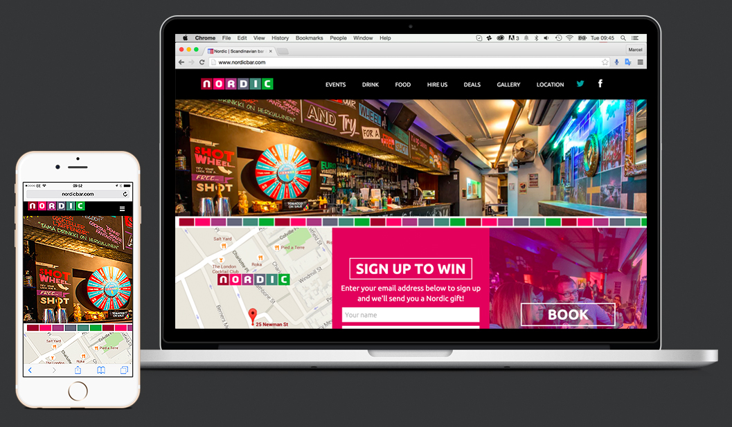
There is a lot of buzz around about websites needing to be responsive. But what does that mean? Responsive web design is a collection of techniques that allow a website to adapt to different device specifications, such as screen size when being viewed. What it means in a more ‘practical’ way, is that, the website is able to recognize the features of the desktop, smartphone or tablet, and easily adapt to it to give an optimal user experience without limiting the functionality. The reasons for this adaptability are very clear. In the second half of 2015, and the beginning of 2016, the usage of smartphones to browse the web is estimated to increase by about 20% compared to the last two years. Therefore, it is increasingly important to keep these users in mind and understand how to properly engage with them to offer the best user experience on all devices. How can we make a better online user experience? Before responsive design, the mobile experience usually translated poorly. The first step towards a better user experience was to create mobile versions of the traditional websites. This is one type of solution but still their capabilities were limited. This is where responsive design comes into play. Thanks to responsive design your users won’t be worried about having to be careful of where they click if using a touch screen or zooming in and out, they simply will enjoy the site as if it were tailored to that device. The image provided above is a perfect example of what we have done with one of the best bars in London, Nordic. Now their website is perfect for big screens and even better on your smartphone. Our next posts will cover further benefits of responsive design plus a checklist of what you should […]