February 19, 2020
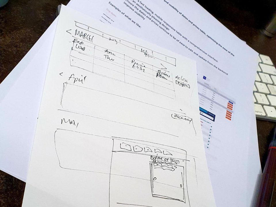
I love the evolution of our work from a sketch to full working website that adds value to a business! We’ve worked with The Dragon Trip for a number of years now, having created their brand platform and designed and built their adventure tours website. Towards the end of last year we worked with them to transform their online offering and enable them to take bookings and deposit payments for the first time through their website. This isn’t as easy as it sounds and took some effort on their side to work with internal processes to change the way they work to benefit from these small but essential changes. The new site and booking platform went live just before Black Friday last year and we are really pleased that bookings started to grow off the back of this work. The Corona virus hasn’t helped business at the start of this year, but we continue to support the team and know they are agile enough to ride the ups and downs.
December 10, 2015
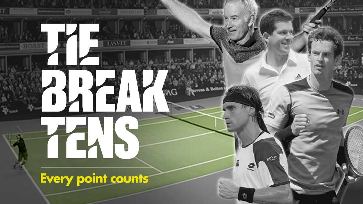
Tie Break Tens is an exciting new concept in tennis, think 20/20 for cricket, and The Island were lucky enough to be asked to design and build the website as well as all the marketing and promotional collateral. It was a hectic few months as anything brand new tends to grow organically so we had to be totally adaptable to changing formats and requests from all stakeholders in the event. The night itself was a massive success with Andy Murray, John McEnroe, David Ferrer, Tim Henman and, eventual winner, Kyle Edmund gracing the TBT court. With any new concept there are tweaks and changes that can be made but it was amazing to be part of a revolution in a sport. Click here to read more about all the work The Island created for Tie Break Tens tennis.
November 11, 2015
Today’s topic is mobile SEO to underline the fact the world is really going mobile. Everywhere you look nowadays you see people hunched over smartphones. You can really say the world is turning mobile. With a smartphone you can perform almost any task you wish and most times it offers more capabilities than a personal computer. This is also due to mobile SEO.
October 28, 2015
Digital marketing is a skill that can be mastered with a lot of practice through time. To get there you can obviously go through some bad times. That means also learning how to improve digital marketing results. This is something inevitable and today we will explore eight ways to overcome them and turn them around.
October 14, 2015
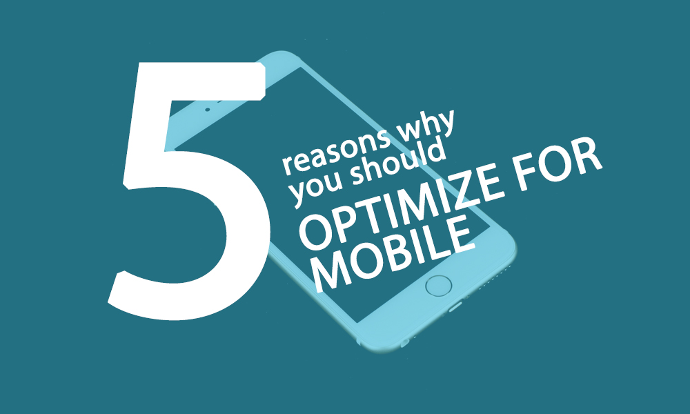
When it comes to the web in this modern day and age, especially e-commerce websites, mobile optimisation is key. Without it you are potentially missing out on a percentage of sales. Research shows that a massive 57% of mobile users if the loading time is more than 3 seconds.
October 6, 2015

Hospitality websites are fiercely competitive. The key is to make information easily accessible to the users. If this isn’t true on your website, the guest will leave and visit the next website that popped up on Google.
September 15, 2015
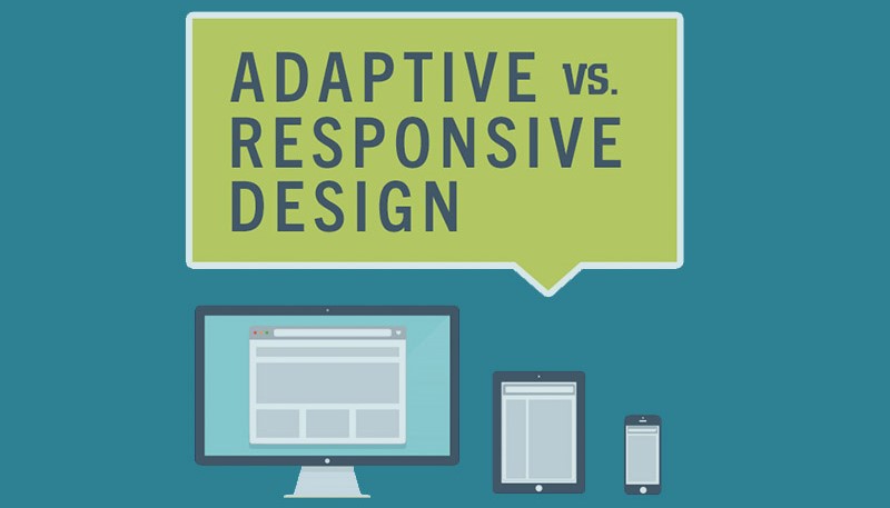
Google has always recommended a responsive web design and rolled out an important update earlier in April this year. This updates works to rank mobile-friendly sites higher based on web design. The secret behind the updated is, it doesn’t specify you use responsive designs, more that your site be accessible from mobile devices, with a good user experience and performance. Keeping that in mind what are the options available to those who are looking at starting their own site? We have already spoken about responsive design in a previous series of post – which if you haven’t read, we suggest you do to find out more and you can find them here!
July 23, 2015
Welcome to part 2 of our responsive design series, if you missed the first post, be sure to check it out here. In this second post we will talk about some of the benefits responsive design has to offer. 1. Flexible web design No matter what device the user experience will be the same. It helps your business be recognized and to be honest people enjoy a good user experience, there is nothing worse than waiting for ever to load a page or complete a login. Happy customers definitely mean happy business. 2. Cost effective website Compare the cost of ‘owning’ one site or owning two…maths aside, you can easily save money and time as you will be able to concentrate on functions, content and updates for a single website that will work seamlessly across devices. 3. Search engine optimization Google itself recommends a responsive web design and the importance of SEO in today’s market means that everything must be on point. If you use the one website for your business you will be able to concentrate properly and create effective SEO. Also all your results will be in the one place. 4. Improved conversion rates A well designed website that is optimized and consistent will for sure have a positive impact on the conversion rate of your site. People will be familiar with functionality and layout, therefore providing them with a better user experience that translates to engagement. 5. Future viability of your website Responsive sites are made to adapt to different systems and characteristics, meaning it is pretty sure that once designed, and designed properly, it shouldn’t require too much work when newer devices hit the market. This point links back to cost effectiveness. [contact-form-7 id=”400″ title=”The contact form”]